
Why Custom Vape Packaging Fails at Retail and How to Prevent It
A vape product can have solid hardware, a familiar flavor profile, and a fair retail price, yet still lose at the shelf because the box looks confusing, flimsy, too loud, or legally risky. Custom vape packaging fails most often when it is approved as a flat mockup instead of checked as a retail object: in hand, under store lighting, beside competitors, with required warnings and SKU details in place.
The shelf test most mockups skip
A clean digital render can hide the problems that matter in retail. On screen, a metallic finish looks premium. On a shelf, it may glare under bright lighting and make the nicotine strength or flavor name hard to read. A bold color system can look organized in a design deck but turn chaotic when ten SKUs sit shoulder to shoulder.
The practical rule: judge custom vape packaging at the same distance and speed a shopper or retail clerk will see it. If the main product type, flavor, strength, and warning hierarchy cannot be understood in a few seconds, the design is not retail-ready yet.
This does not mean every package needs to be plain or minimal. It means the design has to survive real shelf conditions: narrow facings, partial obstruction, price stickers, security placement, dust, fingerprints, and quick visual comparison. Packaging that only works when centered in a presentation slide is not finished.

Common retail failure points and how to catch them early
Most packaging problems are not caused by one bad design choice. They come from small decisions that compound: type that is too light, a finish that scuffs, a carton that bows, a warning area squeezed into the wrong panel, or a flavor color that looks too close to another SKU. The table below gives a useful pre-print diagnostic.
| Failure point | What it looks like at retail | Prevention rule |
|---|---|---|
| Poor information hierarchy | The shopper sees artwork but cannot quickly identify format, flavor, or strength. | Make the buying information larger and clearer than decorative copy. |
| Overdesigned graphics | The package attracts attention but feels juvenile, chaotic, or hard to trust. | Use color and illustration carefully, especially in an age-restricted category. |
| Weak carton structure | Boxes crush, bow, or look used before purchase. | Match board weight and insert design to the actual product weight and shape. |
| Finish mismatch | Gloss, foil, or dark ink shows scratches and fingerprints quickly. | Proof finishes on physical stock, not only on a digital render. |
| Compliance crowding | Required warnings or product details look pasted on after the design was finished. | Reserve compliance space from the first layout, not at the final approval stage. |
| SKU confusion | Similar flavors, strengths, or device types are easy to mix up. | Create a consistent but distinct SKU coding system before expanding the line. |
Compliance space is not leftover space
Vape packaging sits in a regulated, age-sensitive category. Requirements vary by market and product type, and brands should verify label, warning, ingredient, nicotine, age restriction, and child-resistant packaging obligations with qualified regulatory support before printing. The important design point is simple: compliance cannot be treated as a sticker added after the artwork is approved.
If warning text, product identifiers, batch details, or required symbols are forced into leftover corners, the whole package can look less credible. Worse, a late compliance change can disrupt a finished print file, delay a run, or create inventory that cannot be used in a target market.
A safer planning sequence
- Identify the markets where the package will be sold.
- Confirm the required warnings, age statements, symbols, and product information for those markets.
- Block out fixed compliance zones before creative exploration.
- Design brand elements around those zones instead of covering them later.
- Review physical proofs with the final legal copy, not placeholder text.
Recent public debate around colorful vape packaging and youth appeal reinforces why presentation matters beyond aesthetics. For example, News Medical’s coverage of vape packaging aesthetics is useful because it shows how regulators and public health commentators scrutinize visual appeal in this category. That does not create a universal design rule, but it does underline the need for adult-oriented, compliant, defensible packaging choices.
Readable beats clever on a crowded shelf
Custom vape packaging often fails because the brand tries to say too much at once. The front panel becomes a stack of flavor claims, puff-style cues, icons, slogans, device notes, and decorative effects. The result may look energetic, but it asks the shopper to work too hard.
A useful front-panel hierarchy is usually built around three questions:
- What is it? Device type, cartridge, pod, e-liquid, accessory, or other format should be immediately clear.
- Which variant is it? Flavor, strength, size, or other SKU-defining detail should be easy to distinguish.
- Can I trust it? The packaging should look controlled, legible, and appropriate for an adult retail environment.
The tradeoff is that some creative ideas need to move to secondary panels. A side panel can carry longer brand copy. A back panel can organize technical or regulatory information. The front panel should not have to perform every job.
One practical test: print the front panel at actual size, place it five to six feet away, and give someone three seconds to identify the product type and variant. If they hesitate, the design may need clearer typography, stronger contrast, or less decorative competition.
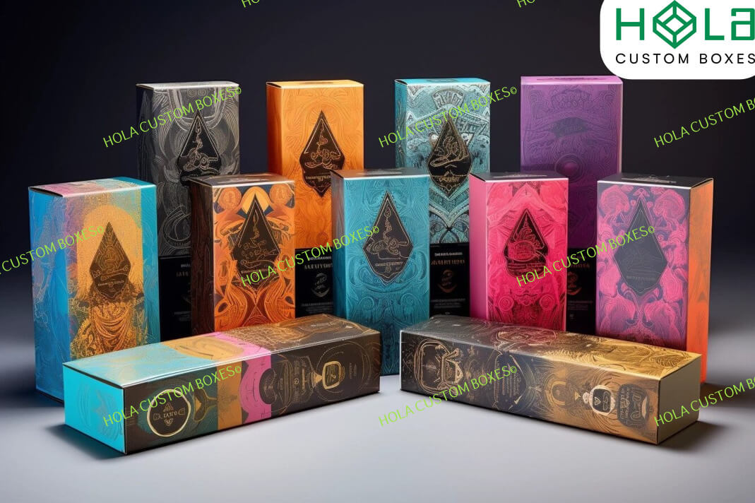
Materials and finishes can make a premium design look cheap
Material choice affects shelf performance as much as artwork. A thin carton may save cost upfront but crease around heavier devices or multi-component packs. A soft-touch finish may feel refined but can show handling marks depending on ink coverage and stock. Dark backgrounds can look sharp in renders but reveal scuffs sooner in busy retail environments.
The right question is not “Which finish looks premium?” It is “Which finish still looks acceptable after shipping, stocking, handling, and sitting under retail lighting?” That shift changes the proofing process.
What to check on physical samples
- Edge wear: Dark inks and laminated edges can show abrasion quickly.
- Panel stiffness: Large panels should not bow around the product or insert.
- Insert fit: The product should not rattle, press against weak corners, or deform the box.
- Ink contrast: Warning text and SKU information should stay readable on the chosen stock.
- Opening experience: Closures should feel controlled without making adult access unnecessarily frustrating.
There is always a cost tradeoff. Heavier board, specialty finishes, inserts, and complex structures can increase production cost and lead time. But underbuilding the package can create a worse retail signal: the product may look damaged or low-value before anyone opens it.
Flavor and color systems need guardrails
Flavor-driven categories often lean on color because it helps customers scan quickly. Blue suggests blueberry or menthol-style coolness in many retail contexts; green may suggest mint, lime, apple, or menthol depending on the line; red may imply strawberry, cherry, or fruit punch. Color can help, but it can also create confusion when a brand expands.
A preventable mistake is designing one attractive package at a time. The first three SKUs may look distinct. By the tenth, the color palette overlaps, the flavor names shrink, and retail staff have a harder time pulling the right unit.
Build the system before the full line arrives. Decide which elements stay constant and which change by SKU. For example, the brand block, warning area, and format label might stay fixed, while a controlled color band and large flavor name change. This creates shelf consistency without making every variant look identical.
For consumer-facing flavor decisions, packaging is only one piece of understanding. Educational guides such as Blueberry Ice Vape vs Plain Blueberry show how small wording differences can shape expectations. The packaging lesson is that flavor language should be specific enough to reduce surprise, not so decorative that it hides the actual profile.
Retailers notice practical problems before shoppers do
A package may look good to the brand team but frustrate the people who stock, price, and sell it. Retailers care about clear SKUs, easy stacking, barcode placement, tamper evidence where applicable, and packaging that does not collapse in a display. If the box is awkward to merchandise, it may not get the facing the brand expected.
Before a bulk print run, review the package as a retail operations item:
- Can the barcode be scanned without rotating the box several times?
- Will price stickers cover important information?
- Does the package stand upright, hang, or sit in a tray as intended?
- Are similar SKUs easy for staff to separate during restocking?
- Does case packing protect the retail cartons during transit?
This is where packaging and wholesale planning overlap. A low unit cost can be undermined by poor sell-through, damaged cartons, or avoidable restocking confusion. For a broader look at buying variables that affect retail margins, see Bulk Disposable Vape Costs and How to Buy Vape Wholesale With Better Margins and Fewer Stockouts.
A pre-print checklist for custom vape packaging
The most useful time to catch packaging failure is before plates, dies, cartons, labels, or bulk production are committed. A small proofing discipline can prevent expensive rework.
- Print at actual size. Review type size, contrast, and spacing on paper or production stock, not just on screen.
- Mock up the full SKU set. Place variants side by side to catch color overlap and naming confusion.
- Add final compliance text early. Do not approve a design using placeholder warnings or shortened copy.
- Test shelf distance. Check whether product type and variant are clear from normal browsing distance.
- Handle the sample. Look for fingerprints, scuffs, weak corners, and closure issues.
- Check retailer use cases. Scan the barcode, apply a sample price sticker, and place the unit in the expected display orientation.
- Review market fit. Confirm that the tone, imagery, and claims are appropriate for adult buyers and the intended selling region.
- Document approvals. Keep final dielines, copy, warning placement, color references, and proof approvals organized for future reorders.
The decision rule is straightforward: if a problem appears in a hand sample, it will usually become more expensive in a bulk run. Fixing hierarchy, structure, or copy before production is less painful than explaining unsellable inventory later.
What not to assume from packaging alone
Packaging can support trust, but it cannot prove product quality, legal status, or user fit by itself. A polished box does not replace proper sourcing, documentation, age-gated retail practices, or product-specific review. For consumers who are still learning the category, educational resources such as Was Ist Eine Vape and What Should You Check Before Buying One? and Torch Disposable Vape for First-Time Buyers explain why shelf appearance should be only one part of evaluation.
For brands, the same principle applies in reverse. Strong packaging cannot rescue unclear positioning, poor SKU planning, or weak retail execution. Its job is to make the right information visible, protect the product presentation, and avoid creating doubt before the product is considered.
FAQ
What is the biggest reason custom vape packaging underperforms at retail?
The most common reason is that the package is designed as artwork rather than a retail communication tool. If shoppers cannot quickly identify the product type, variant, and required information, the design may attract attention but still fail to support purchase decisions.
Should vape packaging use bright colors?
Color can help distinguish flavors and SKUs, but it needs restraint and compliance review. In an age-restricted category, overly playful or youth-oriented visual cues can create brand and regulatory concerns. Use color to organize information, not to overwhelm it.
Is premium finishing worth it?
Sometimes, but only if the finish holds up in the real retail environment. Foil, gloss, matte, and soft-touch effects should be tested on physical samples for readability, scuffing, fingerprints, and edge wear before committing to a large run.
How early should compliance be considered?
At the beginning of the packaging process. Required warnings, age statements, symbols, product details, and market-specific label needs can affect layout, hierarchy, and even structure. Brands should confirm requirements with qualified support before printing.
What should be reviewed before a bulk print run?
Review actual-size samples, the complete SKU family, final compliance text, barcode placement, shelf readability, carton strength, finish durability, and retailer handling needs. A design that passes those checks is less likely to create avoidable shelf problems.
Related Guides in best vape
These related guides connect this article to the site's broader topic map.
- Torch Disposable Vape for First-Time Buyers: What Actually Matters
- Was Ist Eine Vape and What Should You Check Before Buying One?
- Blueberry Ice Vape vs Plain Blueberry: Which Flavor Fits You?
- Bulk Disposable Vape Costs: What Changes the Real Unit Price
- How to Buy Vape Wholesale With Better Margins and Fewer Stockouts
- Disposable Vape Wholesale Mistakes That Can Shrink Your Margins
- Europe Fast Shipping Vape vs Local Stock: Which Saves More Time?
- Is a High Puff Disposable Vape Worth It? Costs, Battery, and Flavor
- Long Lasting Disposable Vape for Heavy Users: What Matters Most
- How to Choose Prefilled Vape Wholesale Without Overstocking Slow Movers
- Vape Bulk Price Negotiation: What Retail Buyers Can Ask For
- Vape Supplier Europe vs China: Which Sourcing Route Makes Sense?


